12+ Mood Board Ideas to Plan Your New Home Decor

✔ Written & fact-checked by Sophie — last reviewed June 26, 2026
When Inspiration Overwhelms Instead of Helps
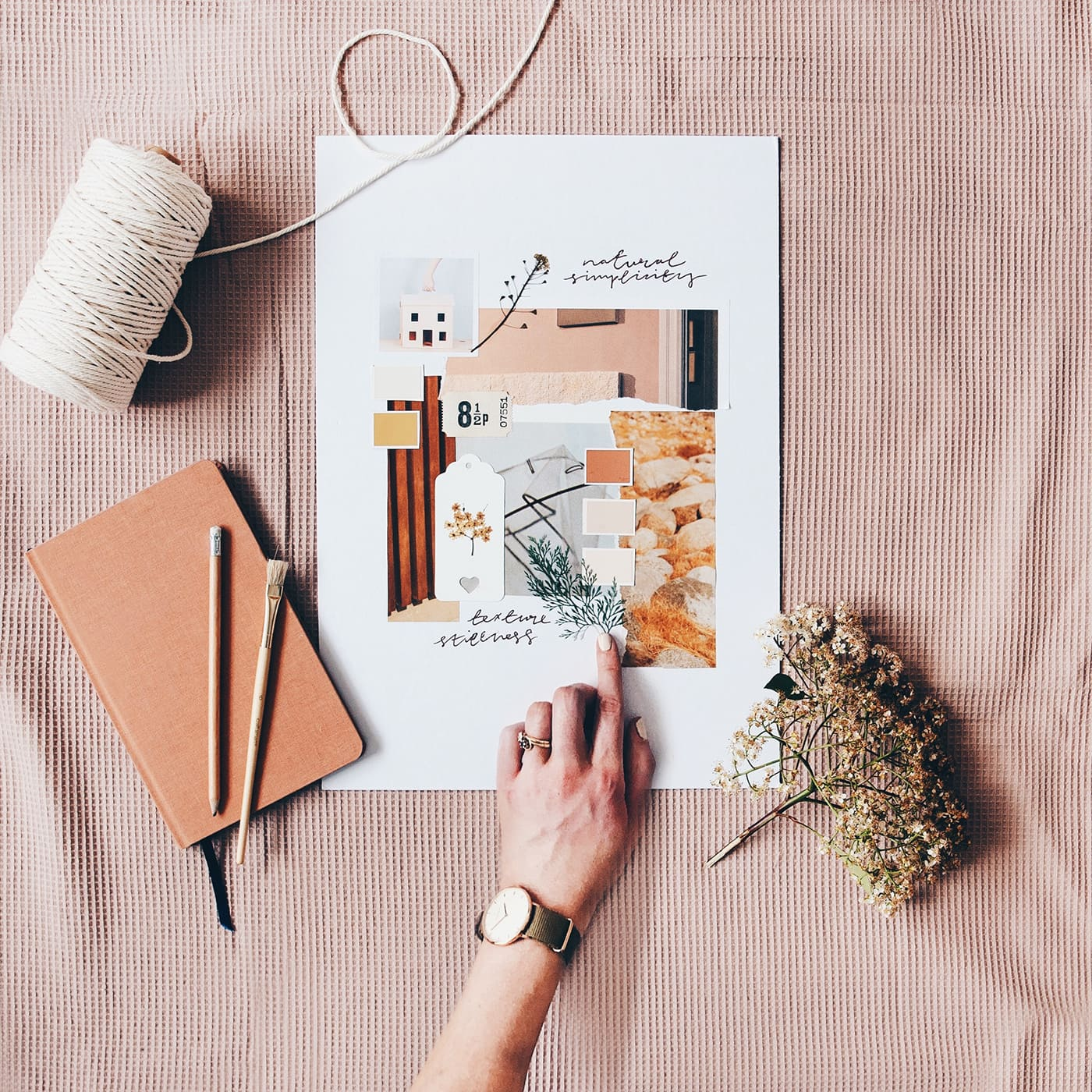
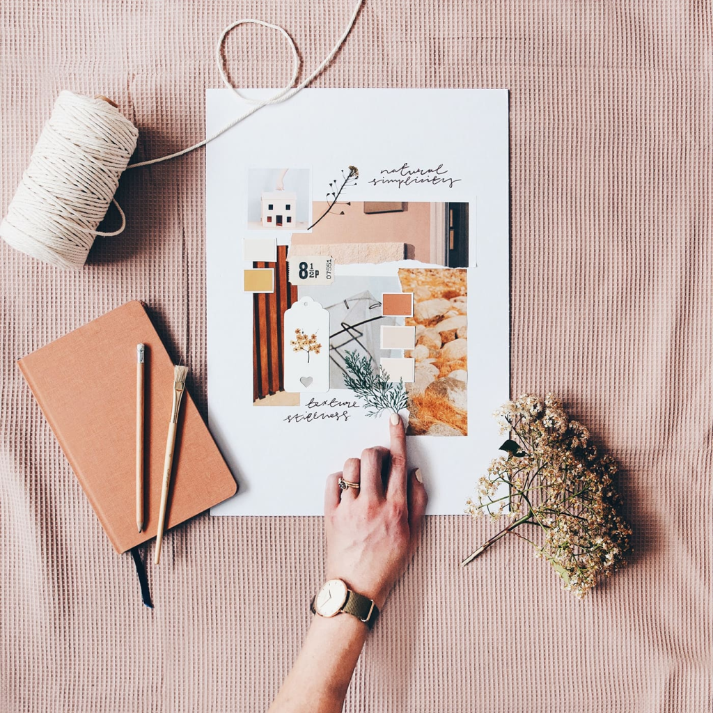
You saved three hundred photos on Instagram. Your Pinterest has seventeen boards named “living room maybe.” And somehow, after all that scrolling, you still can’t pick a single paint color. You’re stuck. Not because you lack taste, but because you have too much input and no filter. That’s exactly where these 12+ mood board ideas to plan your new home decor come in. A mood board isn’t an extra art project. It’s a tool that pulls you out of the scroll hole and hands you a clear yes or no. In this post, I’ll walk you through eighteen interior design mood board ideas that cover digital shortcuts, tactile experiments, and even ways to design with a partner without a fight. You’ll walk away with a method that matches your brain and your budget, and you’ll finally know what to shop for first.
1. The “One Object” Mood Board
Pick one thing you already own and love. A painted vase, a rug you hauled back from a trip, a throw pillow that makes you smile every time. Put it in the middle of a blank board. Designer Justina Blakeney calls this letting one object be “the boss.” From that single item, pull three colors and two textures. Use a free color picker app if you’re not sure. Then only add pieces that earn their place next to your hero. If something fights with the vase’s glaze tone or the rug’s weave, it’s out. This method stops you from building a room that has ten different personalities and no center.
2. The Digital AI First-Draft Board
Before you spend a dime, let an app give you a fast starting point. Tools like Remodel AI, RoomGPT, and Planner 5D let you upload a photo of your empty room and generate a fully styled version in about thirty seconds. The Verge reported that these AI design apps went mainstream in early 2025, and they’ve only gotten easier to use since then. The AI will toss in furniture, rugs, and art, often in combos you’d never think of. Keep what you like, ignore the weird lamp it put on the ceiling. Then bring that image into a digital mood board for home decor using a free app like Milanote, where you can swap out AI picks for real products you’d actually buy. This is a first draft, not a final answer.
3. The Physical Tactile Swatch Board
Screens lie. That soft linen you saw online might feel like sandpaper in person. This is where a real corkboard and actual material samples save you. Grab free paint peel‑and‑stick stickers from Sherwin‑Williams or Benjamin Moore (a set of ten large swatches runs about five to eight dollars). Order fabric sample packs from any online fabric shop. Pin them next to a photo of your room. Jessica Helgerson, a designer known for material‑first spaces, says a screen can’t replicate how wool velvet catches light, and she always pins real swatches before committing. Even some psychology research points to the idea that touching samples cuts down on second‑guessing later. You’ll notice if the paint reads too pink or if the tile feels plastic‑y the moment you pin them side by side. This board is your lie detector.
4. The Colour Story Board
Strip away objects and build a board around nothing but a color palette. Find a 60‑30‑10 split: sixty percent a dominant color, thirty percent a secondary, ten percent an accent. Use a free generator like Coolors or Adobe Color to pull a palette from a photo you love. Now the most important step: test those colors in the actual room’s light. A soft taupe on a bright phone screen can turn murky green in a north‑facing room. Tape the swatches to the wall and check them at morning, noon, and evening. This board isn’t about picking pretty colors, it’s about picking colors that survive your light conditions. The biggest mistake people make right now is skipping this reality check, then wondering why their fifty‑dollar gallon of paint looks wrong at dinnertime.
5. The Texture‑First Board
Forget color for a minute. Gather five to seven materials that you want your hands to touch every day: rough linen, smooth stone, warm wood, cool glass, nubby wool. Pin or lay them out together and photograph the group in black and white on your phone. If the black‑and‑white photo looks flat, you have a texture problem. That means everything reads the same smoothness and your room will feel one‑note. Spoonflower sells a designer sampler of ten fabric cuts for about fifteen dollars, which is perfect for this exercise. Once your textures contrast nicely, you can layer in color knowing the bones already feel good. This is how you make a room that feels comfortable even before you notice the paint.
6. The Biophilic Wellness Board
This goes beyond putting a plant in the corner. Pinterest Predicts flagged “Biophilic Maximalism” for 2025, and it’s still gaining traction, meaning mood boards now include raw stone samples, preserved moss, wood species tags, and even notes on where daylight hits at different times. Start with a piece of natural slate or a chunk of bark. Add a photo of your room with the window marked so you remember which corner gets morning sun. Press a few leaves between book pages and pin them on. This board helps you design a room that supports your circadian rhythm, not just your eye. It’s about feeling rested in a space, not just admiring it.
7. The Dopamine Decor Board
This one is pure joy. Bright yellow, hot pink, squiggly patterns, checkerboard rugs, you name it. The catch? You still edit hard. Bobby Berk warns that a mood board should not look like a shopping cart exploded. His rule: limit yourself to seven to nine items max. For a dopamine board, that means picking one wild wallpaper sample, one vivid art print, one patterned cushion, and so on, then stepping back. Run a “joy check” on every piece: does it spark energy or just noise? Pinterest search data shows “mood board colour palette happy” jumped a lot in 2025, so people are craving this intentional happiness. Your board should feel like a good playlist, not a siren.
8. The Era‑Specific Board
Pick a decade and commit. A 1970s groove board might hold walnut tones, ribbed glass, and a mustard velvet swatch. An Art Deco board gets black lacquer, gold metal, and geometric shapes. This narrows your choices instantly because you’re not shopping the entire internet, you’re shopping a twenty‑year window. Research what materials actually came from that era, then mix in one modern light fixture or a current sofa shape so the room doesn’t look like a museum set. Your board will guide you to specific finishes and keep you from impulse buying that boho macrame chair that has nothing to do with your Deco plan.
9. The Art‑Centric Board
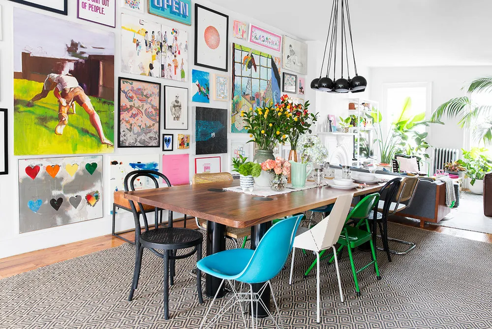
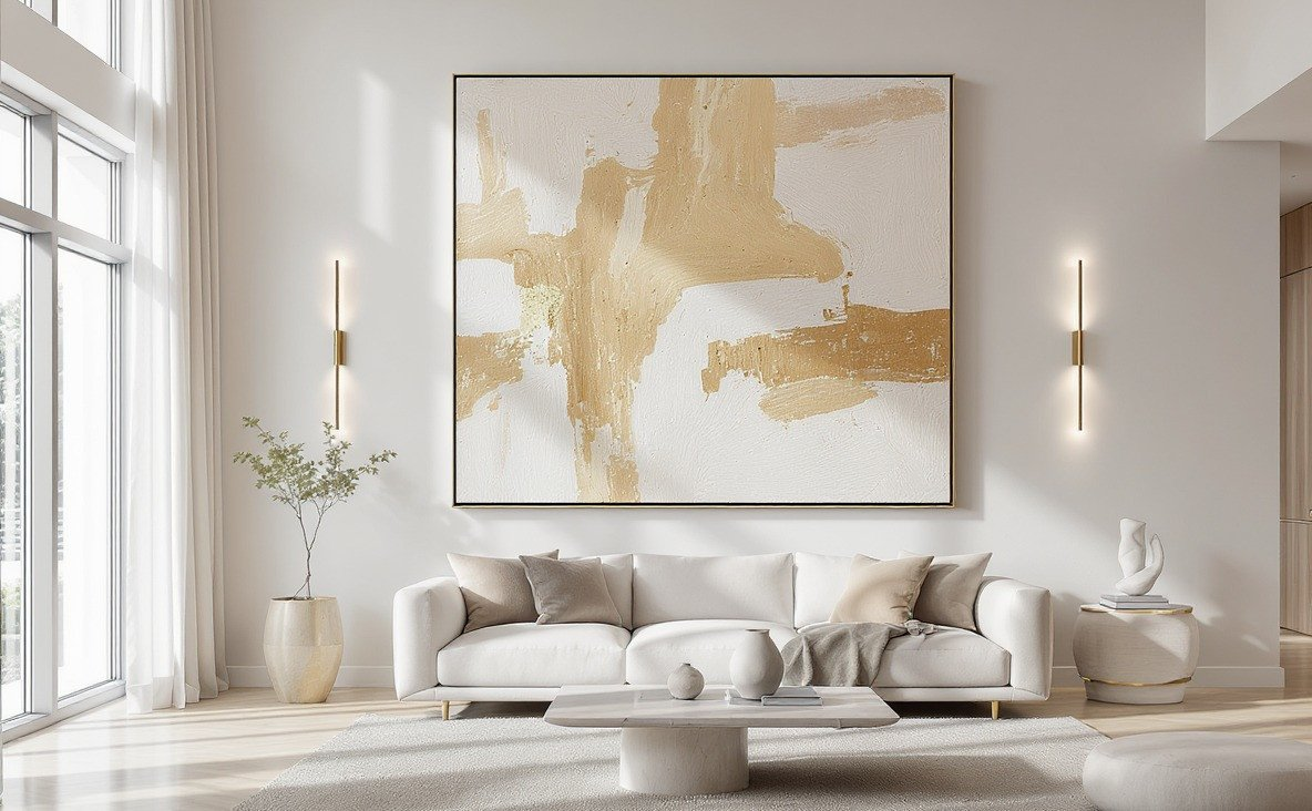
Start with a piece of art you love, whether it’s a print you bought or a canvas you painted yourself. Pull the dominant color for your walls, the secondary color for the sofa or rug, and the accent color for a few small objects. Frame samples and matte options can also go on the board. The artwork sets the emotional tone. A moody landscape will lead you to deeper tones and soft textures, while a bright abstract will pull you toward cleaner lines and bolder accents. By leading with art, you guarantee the room has a soul from day one, not just furniture.
10. The Travel Memory Board
You know that textile you bought in Oaxaca that’s been sitting in a drawer? Or the stack of photos from a coastal trip where you loved the colors of the fishing boats? Pin them on a board. Extract the ochre, the faded blue, the sun‑bleached wood tone. The goal is to pull the feeling of a place into your home without turning the room into a themed restaurant. Photograph your souvenirs together against a plain background to see if the colors actually work as a group. This board tells a story only you know, but anyone walking in will feel the warmth of it.
Image Prompt: iPhone photo of a mood board with a woven textile pinned at the top, a few travel photos printed on matte paper tucked under a piece of driftwood, the board leaning on a dresser with one corner resting on a book, the light from a window making the textile colors softer, casual iPhone photo taken by the homeowner, slightly imperfect framing, real lived-in space, not styled for social media
11. The Sustainable Materials Board
Challenge yourself to use only recycled, upcycled, natural, or certified materials. This means FSC‑certified wood samples, organic linen swatches, recycled glass tile chips, and plastic‑free packaging tags. Many material suppliers now send free sample boxes to pros, but homeowners can request single samples too. An app like Good On You’s home extension can help you check a brand’s eco claims. Pin the certifications or take photos of the labels. This board proves you don’t need to sacrifice style for ethics, it just forces you to shop slower and smarter.
12. The Maximalist Pattern Clash Board
You want three or four patterns in one room. You can do it without a headache if you use scale. Pick one large‑scale pattern (like a floral), one medium (a stripe or geometric), and one small (a dot or tiny check). Add a “break” solid color that appears in all of them to tie things together. Pin them in a row and squint. If any pattern jumps out and screams, swap it. Bobby Berk’s editing rule applies here double: seven to nine items total, patterns included. This board teaches you that maximalism is about rhythm, not chaos. You’ll know you got it right when the clashing feels like a conversation, not an argument.
13. The Monochromatic Minimalist Board
Choose one color, then pin fifteen swatches of that same hue from barely‑there to deep. You’ll use different textures to create depth: a smooth plaster paint chip, a nubby wool, a shiny tile, a matte wood stain. This is quiet luxury without the coldness. A monochromatic board forces you to see nuance, and it stops you from adding “just a pop of color” that breaks the calm you wanted. Rooms designed this way feel larger and more restful. The secret is never using fewer than five tones of the same color, or it looks flat.
Your Next Move Is Just One Board Away
You don’t need to try all eighteen. Pick one that fits how your brain works right now. If you’re visual but overwhelmed, start with the one object board. If you’re techy and short on time, the AI first‑draft board takes sixty seconds. Learning how to create a mood board for decorating isn’t about being artsy, it’s about giving yourself permission to focus. Once you have that first board, you’ll notice the scroll hole doesn’t pull you in as much because you already know what you’re looking for. So grab a piece of cardboard, a few paint chips, or open a blank Milanote canvas. Make one board this weekend. Tag me when you do. I’d love to see where your home is headed next.