14 Cohesive Color Palette Ideas for a new House

✔ Written & fact-checked by Sophie — last reviewed June 26, 2026
Why Your Rooms Look Great Alone But Weird Together
You walk from your living room to your bedroom, and something feels off. Each room looks fine on its own. Put them together though, and your home feels choppy, like every space was decorated by a different person. That disconnect is exactly what a whole house color palette fixes.
A cohesive color palette for your whole house is not about painting every room the same shade. It’s about picking a small set of colors that talk to each other, then repeating them in different amounts from room to room. Do that, and your home reads as one connected space instead of a stack of unrelated rooms.
Below are 14 palettes you can copy, plus the simple rule that makes any of them flow. You’ll see which colors go where, what’s actually trending for 2026, and one surprising trick that makes small rooms feel bigger, not smaller. Pick the one that fits your floors and furniture, and you’re already halfway done.
How to Make a Whole House Color Palette That Flows
Before you fall for a palette, learn the one formula designers lean on. It’s called the 60-30-10 split. You give 60 percent of a space to your main color, 30 percent to a second color, and 10 percent to an accent. Walls usually carry the 60. Big furniture and rugs take the 30. Pillows, art, and small pieces fill the last 10.
The next rule matters even more. Keep your colors in the same undertone family. A green beige in one room sitting next to a pink beige in the next will fight, even when both look nice alone. If you can see two rooms at once, their undertones need to agree.
1. Warm Greige, Soft White, and Black
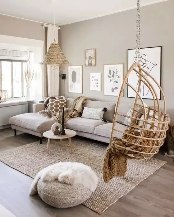
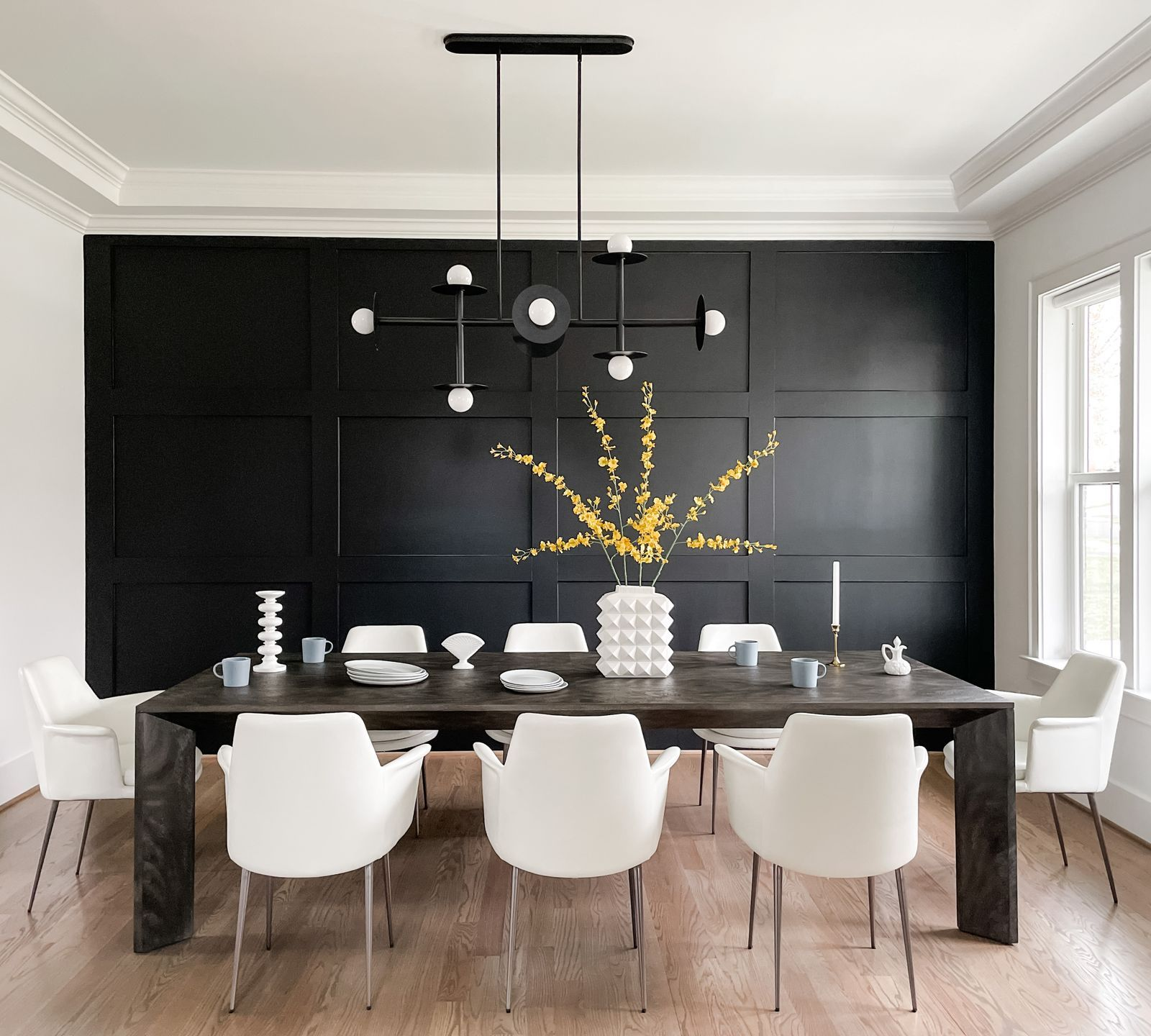
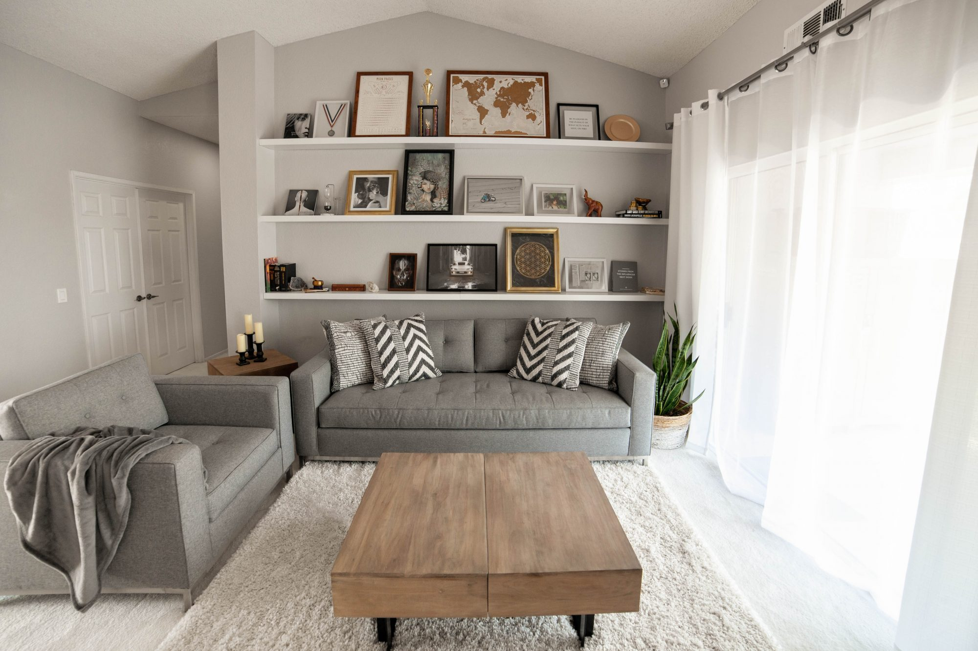
This is the safe palette that still looks current. Start with a warm greige on your main walls, something like Sherwin Williams Universal Khaki, the brand’s 2026 color of the year. Their color marketing director, Sue Wadden, calls it a “go anywhere shade” with a grounded feel. Layer a soft white onto your trim and ceilings, then add black through hardware, picture frames, and a lamp base. The greige carries most of the house, the white connects every room, and the black gives your eye somewhere to land. It’s the kind of palette that won’t feel dated in two years.
2. Espresso, Cream, and Brass
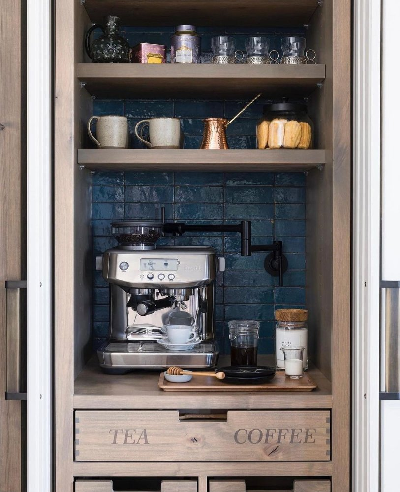
Want depth without going dark in every room? Use a rich espresso brown as your anchor in one or two spaces, like an office or a set of built in shelves. Benjamin Moore Silhouette, their 2026 pick, is a brown that leans into charcoal and looks expensive. Keep the rest of your walls a creamy white so the brown feels like a choice, not an accident. Brass hardware and natural wood tie the two together. Here’s the surprising part. A deep brown room often feels bigger and more wrapped around you, not smaller, which is the exact reason designers reach for it in offices and libraries.
3. Tone on Tone Soft White
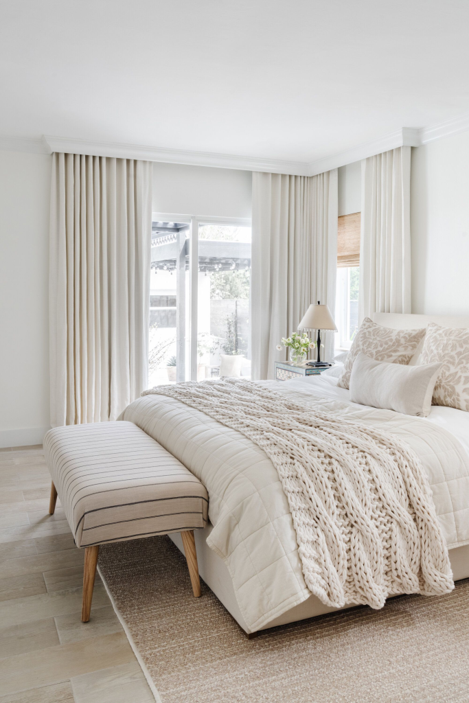
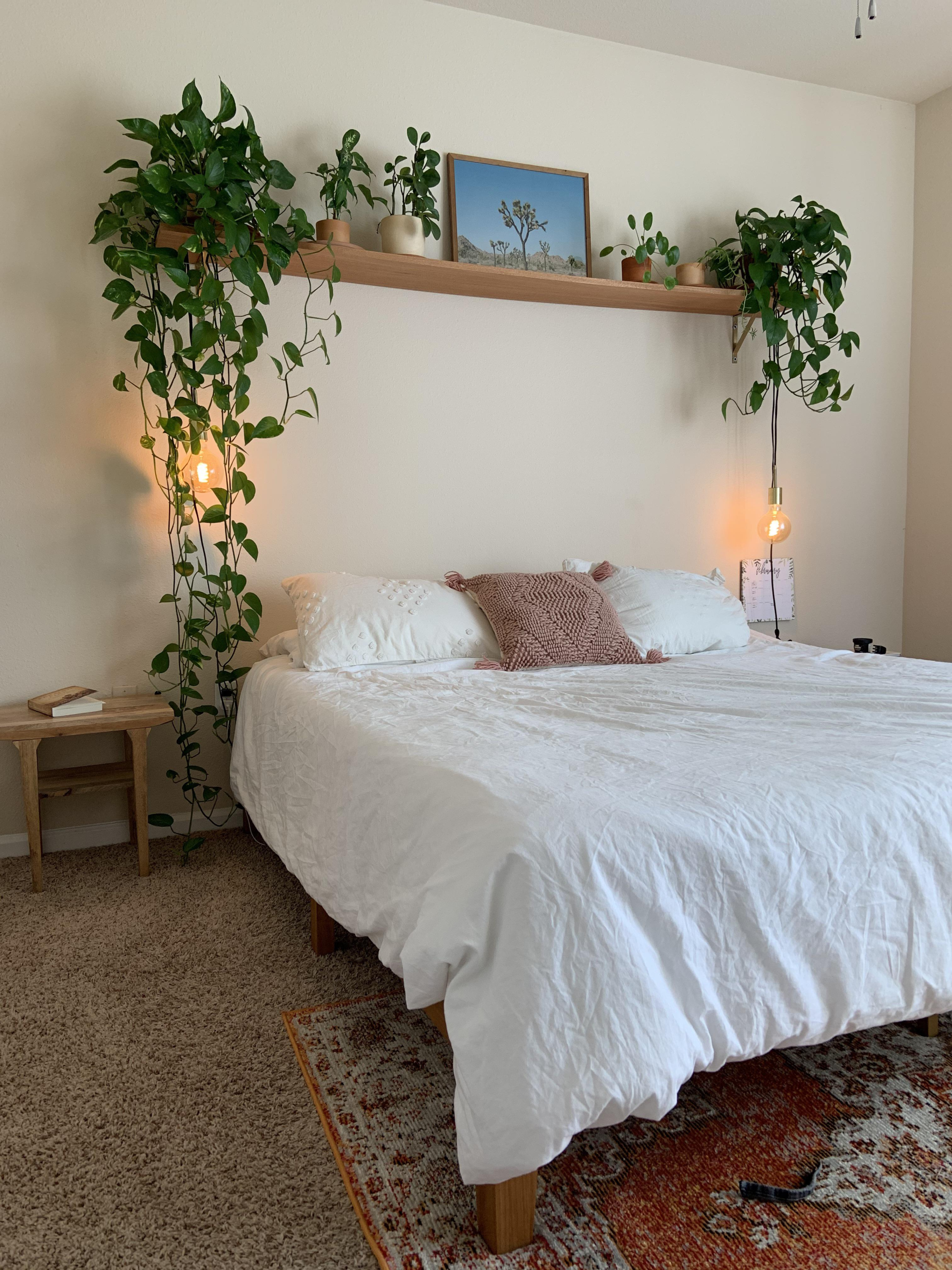
If color makes you nervous, this one’s for you. Pantone named a soft white called Cloud Dancer its 2026 color of the year, the first white the brand has ever chosen. The trick with an all white palette is texture, since flat white walls can look bare. Layer different materials like plaster, a chunky knit throw, and natural wood so the white has something to play off. Add one grounding color too, maybe a clay pot or a walnut stool, so the room doesn’t read as empty. Repeat that same white on every wall, and your whole house links up with almost no effort.
4. Terracotta, Clay, and Warm Stone
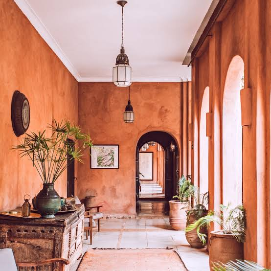
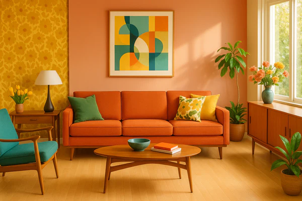
This palette brings warmth the second you walk in. Paint most of your walls a warm stone color, then give one focal wall a terracotta shade behind the sofa or bed. Use a soft clay tone on your trim and shelving to bridge the two. Designers are leaning hard into these nature colors for 2026, since they add personality without shouting. Pair the look with cognac leather and brass, and skip the cool gray metals, which clash against a warm base. The result feels grounded and welcoming, not loud.
5. Moss Green, Charcoal Sage, and Ivory
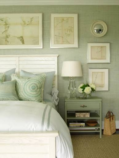
Green is the color people trust most, because it reminds us of being outside. Use a soft moss green as a calm base in bedrooms or a study. Bring in a deeper charcoal sage for depth on a door, a cabinet, or the lower half of a wall. Then tie it all together with an ivory white that keeps the rooms light. Green palettes feel easy to live with, which is why so many 2026 designers reach for them to soften spaces that felt too plain. It’s a low risk way to use real color.
6. Smoky Teal Over a Warm Neutral
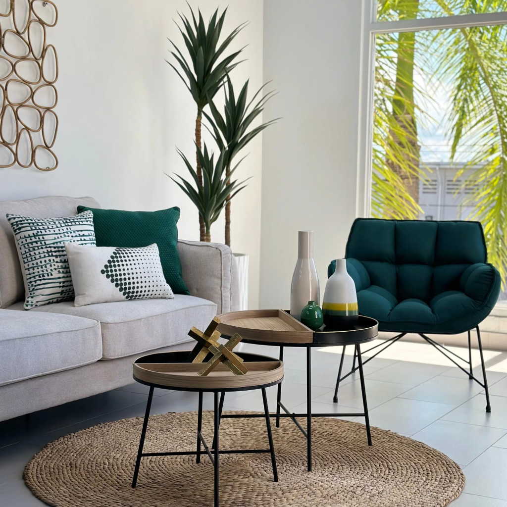
Here’s how to add a bold color with very little risk. Keep your whole house in a warm neutral, then drop in a smoky teal as your 10 percent accent. Behr picked a teal called Hidden Gem as its 2026 color, and designers suggest using it in one standout piece, like an accent chair or an ottoman. Because the rest of the room stays neutral, the teal pops instead of taking over. Best of all, if you stop loving it in a year, you swap one chair, not a whole room.
7. Plum, Green, and Neutral
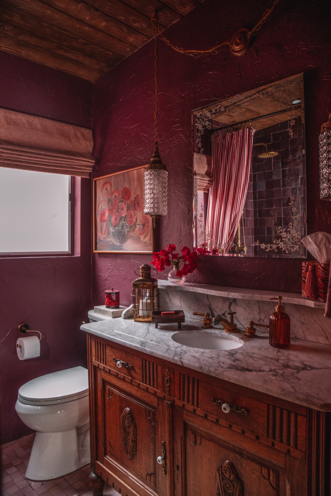
Plum sounds scary until you see it done right. Try color drenching a small room like a powder room or office, painting the walls, trim, and ceiling all in a soft plum. Designer Zoe Feldman has used plum on walls and trim for years, and it reads elegant, not loud. Keep your connecting rooms in warm neutrals, then add a touch of green nearby, since plum and green love each other. The drenched room becomes a happy surprise, while the rest of the house stays calm and quiet.
8. Oxblood, Neutral Wood, and White
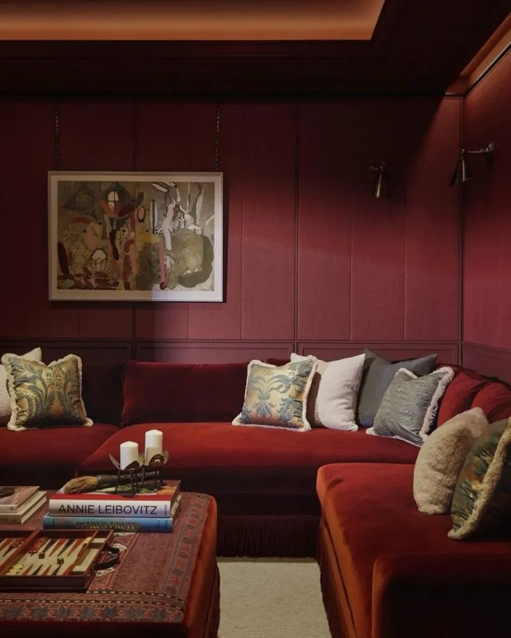
Oxblood is a deep wine red, and it’s showing up everywhere in 2026. The smart way to use it is against calm, neutral surroundings. Designers pair oxblood with natural oak floors and plenty of black and white, which keeps the red from feeling heavy. Try it on a den wall, a painted dresser, or even a single armchair. The neutral wood and crisp white do the balancing, so the wine red feels rich instead of overwhelming. A little goes a long way here.
9. Blue Tonal From Gray Blue to Navy
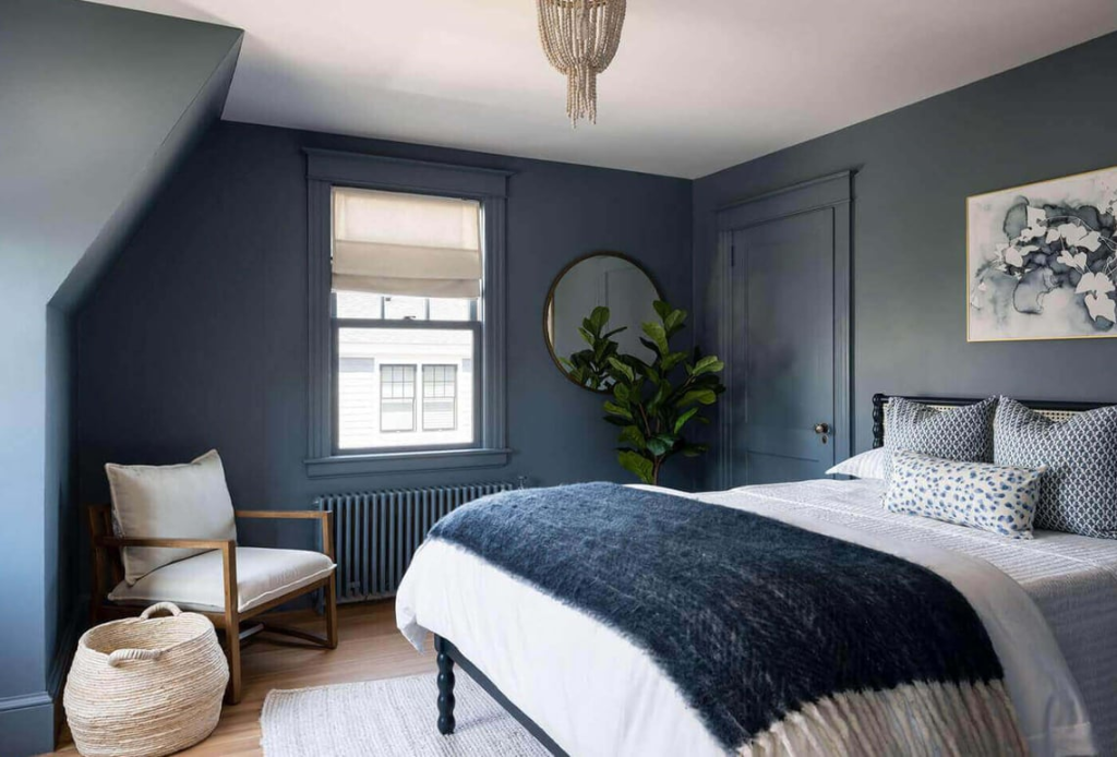
Love blue? Use it across your whole house in different strengths. Start with a soft gray blue in your open areas, move to a truer blue in a bedroom, then go deep navy in a study or powder room. This is an old designer move. You pick one color family and step it lighter or darker as you walk through the house. Repeat the blue in rugs, art, and pillows too, and every room will feel related even though no two are the exact same shade.
10. Wheat, Caramel, and Burnt Umber
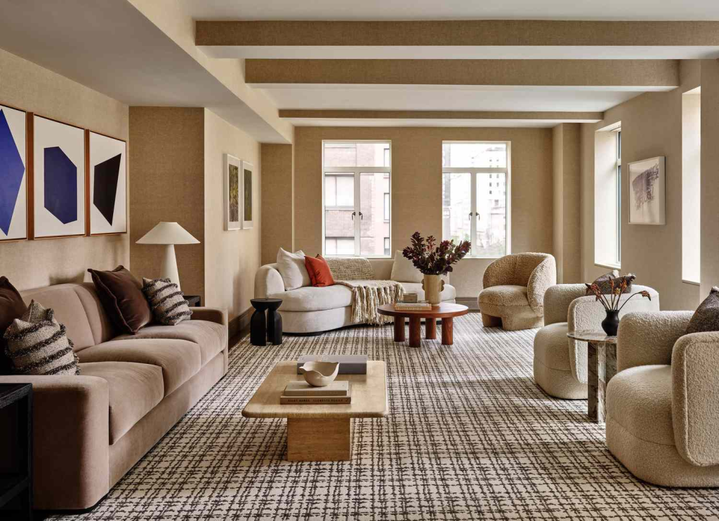
This is the full warm neutral hug, with no gray in sight. Use a soft wheat color on most walls, a caramel tone on your bigger furniture, and burnt umber or clay as your accent. The team at Slifer Designs says clients want colors that feel grounded right now, like wheat, caramel, and warm taupe, not the cool grays of the last decade. These shades sit beautifully against wood and natural textures. Walk into a home done this way, and it feels settled the moment you step inside.
11. Mauve Color Story
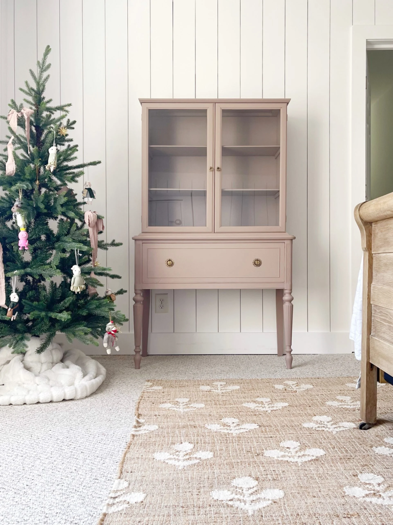
Mauve is a soft, dusty purple pink, and it’s quietly trending. Designer Jenna Gross color drenched a closet in a soft mauve using Farrow and Ball’s Dead Salmon, and the room turned out soft and pretty. You don’t need a whole house of it. Pick one room to drench, then echo the mauve in small ways elsewhere, like a throw pillow or a piece of art. That repeating thread is what makes a color story work. The color shows up here and there, so the house feels connected, not matchy.
12. Amber and Burnt Caramel as a Color Neutral
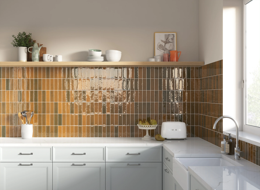
If color scares you, start right here. Amber and burnt caramel act like neutrals, but they bring real warmth and a little richness. Designer Emily Henderson calls amber a great gateway color, since it feels like a warm neutral and a true color at the same time. Use it on walls in a main room, or bring it in through a leather chair or amber tile. It plays nice with almost everything in your house, so it’s genuinely hard to get wrong.
13. Deep Forest Green Library
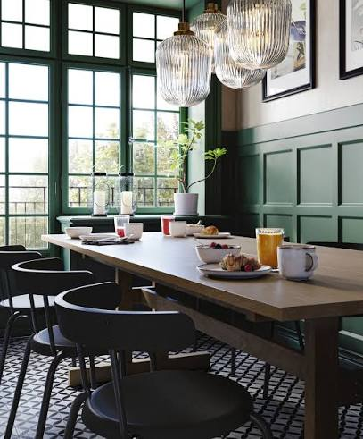
Some rooms beg for drama, and a deep green delivers. Paint a study, a dining room, or a set of built in shelves a rich forest green, like Dunn Edwards Midnight Garden. Keep the rest of your house in creamy neutrals so the green room feels like a treat. Don’t worry that a dark room will feel cramped. A deep, drenched color actually wraps a small room and makes it feel deeper, which is why designers love these shades for libraries and dens. It’s drama you’ll keep loving for years.
14. One Color Through the Whole House
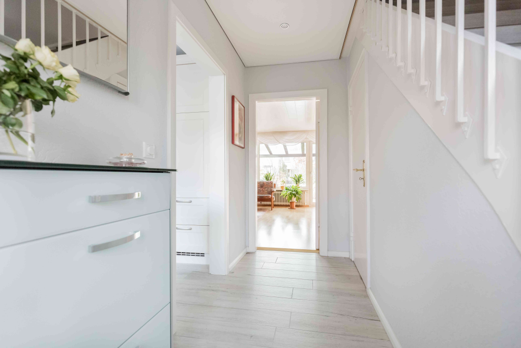
Here’s the simplest cohesive palette of all. Pick one warm white or soft neutral and use it on every main wall in your home. Virginia designer Tracy Morris says painting all the walls one shade lets a home flow naturally from room to room, while your furniture and details carry the personality. To keep it from looking flat, change the finish. Try a satin on trim and a flat on walls, or use a slightly lighter tint on the ceilings. One color, repeated everywhere, is the fastest way to make a house feel like one home.
Picking the Palette That Fits Your Home
Don’t start with a screenshot. Start with what you already own. Look at your floors, your countertops, and your biggest furniture, then match your palette’s undertone to those, since they’re the hardest things to change later. Warm oak floors want warm whites and greiges. Cool marble likes cleaner, cooler colors.
Once you’ve landed on your colors, the real magic is repetition. Use one or two of your shades in every room, just in different amounts. Keep your trim a single color throughout. That’s the whole trick to a home that flows.
A cohesive whole house color palette isn’t about talent or a big budget. It’s a simple system anyone can follow. Pick the palette above that fits your home, grab a few peel and stick samples this week, and test them on your walls before you buy a single gallon. Save this list so it’s ready when you are.