
20+ Modular Kitchen Design Ideas That Are Actually Worth Stealing
Why Your Modular Kitchen Deserves More Thought Than You’re Giving It
I’ll be honest — when I first started helping friends redesign their kitchens, modular was always the “sensible” choice. Practical, yes. But boring? Often. The problem wasn’t the concept — it was that most people were just picking whatever the showroom had on display and calling it done. That’s where things go wrong. A modular kitchen is one of the most customizable spaces in your home. You can control the layout, the finishes, the storage logic, the color — all of it. Whether you’re working with a tiny galley or a generous open-plan space, these ideas will show you what’s actually possible when you stop treating your kitchen like an afterthought.
1. The L-Shaped Layout With a Corner Carousel

The L-shape is honestly my go-to recommendation for most homes, especially mid-sized kitchens. Two walls working together means you get a natural prep zone, a cooking zone, and a cleaning zone without any of them bumping into each other. The corner is the part most people waste — don’t. A carousel unit tucked in there turns dead space into your most-used storage spot. I had one in my last kitchen and I genuinely never had to dig around in the back of a cabinet again. Pair white upper cabinets with warm wood-toned lowers and a quartz countertop for a finish that won’t feel dated in five years.
2. Two-Tone Cabinetry Done Right

Two-tone kitchens are everywhere right now and most of them are overdone. Here’s how I think about it: your base cabinets take the deeper, richer color — navy, forest green, charcoal — and your upper cabinets stay light. White, off-white, or a warm cream. That balance keeps the room from feeling heavy. What I’ve found works best is keeping the hardware consistent across both tones. Matte black pulls on both navy and cream cabinets look intentional rather than accidental. The countertop should bridge them — something like a light marble effect or a pale oak butcher block hits the sweet spot.
3. The Parallel (Galley) Kitchen for Narrow Spaces

I used to think galley kitchens were a compromise. Then I spent a week cooking in one. The efficiency is remarkable — everything within two steps, the work triangle practically built in. If you have a long narrow room, don’t fight it. Work with it. Keep one side for cooking and prep, the other for storage and the fridge. Handleless cabinets on both sides make the walkway feel wider than it actually is. The key mistake people make here is going too dark — stick to light laminates or matte off-white finishes and the space stays breathing.
4. Open Shelving Mixed With Closed Cabinets

Full open shelving sounds good on a mood board. In reality? Dust on everything within three weeks. What actually works is a mix — closed cabinets for the chaos (mismatched containers, cleaning supplies, that drawer of random batteries) and open shelves for the things you’re proud of. I have two open shelves above my prep counter — a few ceramic bowls, my olive oil, a couple of cookbooks. That’s it. It looks intentional because it is. Use the same wood tone as your cabinet doors for the shelf material and the whole thing reads as one coherent design.
5. Sage Green Cabinets With Brass Hardware

I resisted this one longer than I should have. Sage green felt trendy-adjacent — like something that would look embarrassing in four years. But I’ve seen enough of these kitchens now to say it genuinely holds up. The key is going muted, not bright. Think dusty sage, not spring grass. Brass hardware is the right call here — it adds warmth without going full farmhouse. Keep the walls neutral, the countertop light stone or white, and let the cabinetry do the talking. This palette works especially well in kitchens with natural light. In a dark room, swap to a warmer cream-sage tone.
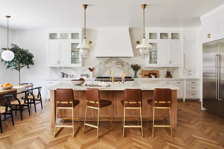
6. The Kitchen Island That Actually Works

Most islands I see are either too big or too small. The right size is one where you can walk around it comfortably — at least 90cm of clearance on all sides. What makes an island earn its place is the under-counter storage. Drawers on two sides, maybe a wine rack on one end, and a countertop overhang on one side that fits two stools. That’s breakfast sorted. I’d skip the built-in cooktop unless you’re doing a serious chef-style kitchen — it complicates ventilation, adds cost, and for most home cooks it’s unnecessary.
7. Handleless Flat-Panel Cabinets for a Clean Look

If your kitchen is on the smaller side, handles are stealing precious visual space from you. Handleless J-pull or push-to-open cabinets give you the same function with none of the visual noise. This is the move if you want a kitchen that photographs well and feels calm to be in. Go for a matte laminate finish rather than high-gloss — gloss shows every fingerprint and the smudging drives me absolutely mad within a day. Warm white or greige works best here. If you want texture, a lightly brushed or woodgrain matte laminate adds depth without adding clutter.
8. Pull-Out Pantry Units

This is the one upgrade I tell everyone to prioritize. A tall pull-out pantry unit — usually 15 to 30cm wide — beside the fridge or at the end of a cabinet run will change your kitchen organization completely. Everything visible at a glance, nothing lost at the back of a shelf. I put one in a galley kitchen remodel last year and the client messaged me a month later to say she’d found spices she’d forgotten she owned. Use adjustable shelves so you can reconfigure for tall bottles versus small jars. Pair it with a similar pull-out for cleaning supplies under the sink and your kitchen actually stays organized.
9. Under-Cabinet Lighting

Most kitchen lighting plans are terrible. One overhead light, maybe a pendant. Then you stand at the counter chopping and cast a shadow on exactly what you’re trying to see. Under-cabinet LEDs fix this completely. Warm white, not cool white — cool white makes everything look clinical and slightly grim. A continuous LED strip along the base of your upper cabinets throws light directly onto the prep surface. It also makes your backsplash look incredible at night, which is a bonus nobody mentions enough.
10. Quartz Countertops Over Granite

Granite had its moment. I think it’s mostly over. Quartz gives you the same visual weight with better performance — more consistent patterning, non-porous, doesn’t need annual sealing. For modular kitchens specifically, the clean veining of quartz reads more intentional next to flat-panel cabinets. My preference is a light background with a subtle grey or warm beige vein rather than the dramatic black-and-gold options that age quickly. Waterfall edges — where the countertop material continues down the side of the island — look expensive and are worth the splurge if your budget allows it.
11. A Statement Backsplash

The backsplash is where you can actually have some fun without committing to it everywhere. I’ve seen subway tile done well and I’ve seen it done boringly — the difference is grout color. Dark grout on white subway tile reads sharp and deliberate. Light grout just disappears. But if you want something with more personality, consider handmade zellige tiles in a warm terracotta or sage, or large-format textured ceramic in a muted tone. Keep everything else neutral and let the backsplash be the thing people notice when they walk into the kitchen.
12. The U-Shaped Layout for Serious Cooks

If you cook regularly and genuinely use your kitchen, the U-shape is the layout most designers quietly recommend. Three walls of counter and storage means you can have dedicated zones that never overlap — prep on one side, cooking in the center, cleaning on the third wall. It works best in kitchens at least 2.5 meters wide so you’re not constantly turning around in a tight triangle. The common mistake is over-filling all three walls with upper cabinets. Leave one wall with open shelving or just keep it lighter — visually it needs to breathe.
13. Tall Units for Maximum Vertical Storage

Most kitchens waste the space above 2 meters. A full-height unit — floor to ceiling — pulls that space into use and makes your kitchen look considered rather than assembled. Use the top section for things you access weekly rather than daily. The real advantage is visual: a tall unit anchors the room and makes the ceiling feel higher because your eye follows the line up. I’d always include at least one tall unit per kitchen, even in smaller spaces. A tall larder unit with pull-outs inside is my pick over a standard pantry cabinet every time.
14. Deep Drawer Base Units Instead of Cupboards

This was the change that genuinely surprised me most in my own kitchen. I replaced three base cupboards with deep drawer units and never looked back. Pots and pans in a drawer — all visible, all accessible with one pull. No more crouching on the floor to find the lid that fell behind the pasta pot. The same goes for your everyday plates and bowls — a deep drawer keeps stacks accessible and you’re not reaching into a dark cupboard every morning. This switch costs a little more upfront but the daily convenience genuinely changes how you feel about your kitchen.
15. Navy Blue Cabinets With White Countertops

Navy is one of those colors that sounds risky and looks completely grounded once it’s in. Paired with a white countertop and white walls, it becomes a high-contrast combination that reads both classic and contemporary. It works especially well in kitchens with good natural light — in dim spaces it can feel a bit heavy. Chrome or brushed nickel hardware is the right call here, not brass. Brass pushes it toward a nautical theme that I find tired. Keep it clean and restrained and navy becomes one of the most timeless cabinet choices you can make.
16. Integrated Appliances for a Built-In Look

The fridge standing out like a steel monolith in an otherwise considered kitchen is something I see constantly. Integrated appliances — where the fridge, dishwasher, and even the microwave are behind matching cabinet panels — completely change the visual logic of the room. Everything reads as one surface. It does cost more and requires planning from the start, but the payoff is significant. At minimum, integrate your dishwasher. It’s the easiest and most affordable of the lot and it immediately makes your kitchen feel like it was designed rather than assembled.
17. A Breakfast Counter Instead of a Separate Dining Table

In open-plan spaces where the kitchen connects to a living area, a built-in breakfast counter at the end of a cabinet run or along the island saves you from needing a full dining table. An overhang of 30 to 35cm on a countertop is enough for two stools. It keeps the space feeling open. I did this in my own apartment kitchen because I genuinely don’t need a four-seater table for daily life — and it’s the best spatial decision I’ve made in that room. Choose stools with a footrest and backrest if this is your primary eating spot. Comfort matters more than looks when you use it every day.
18. Matte Earth Tone Finishes

High-gloss had its run. Matte is where things are now and honestly I think it’ll stay there for a while. The reason isn’t trend-chasing — it’s practical. Matte finishes don’t show fingerprints, they don’t need constant wiping, and they photograph better in real light. For colors, I keep coming back to warm earth tones: dusty terracotta, warm taupe, olive, and biscuit. These work beautifully with natural wood accents and create a kitchen that feels warm and grounded rather than cold and showroom-perfect.
19. Smart Corner Solutions — Beyond the Lazy Susan

The lazy Susan has been the default corner solution forever and I’ve never loved it. Things fall off, you can’t see the back, and it’s rarely actually efficient. Better options exist now: magic corner units that pull out on a mechanism, bringing the back of the cabinet to you; or L-shaped drawer units that use the full corner footprint with no rotation needed. These cost more than a lazy Susan but the functional difference is night and day. If you’re investing in a modular kitchen, the corners are where the money should go.
20. Wood Accents in an Otherwise Modern Kitchen

A fully white or fully grey kitchen can feel sterile no matter how well it’s designed. Wood breaks that up without adding visual chaos. It doesn’t have to be much — an open shelf in oak, a butcher block section of countertop, wooden bar stool seats, or even a wooden tray on the counter. These small material shifts make the kitchen feel lived-in and personal. My preference is light oak or walnut over pine — pine yellows and the grain gets busy. Warm wood tones with cool or neutral cabinet colors is the combination I return to most consistently.
21. Biophilic Touches — Plants, Stone, and Natural Light

This has become a buzzword but the underlying idea is sound. Kitchens that include natural materials and a connection to the outdoors feel better to spend time in. It’s not complicated: a window above the sink that you actually let light through, a couple of herb pots on the sill, a stone or travertine backsplash section, some ceramic accessories instead of plastic. That’s it. You don’t need to tear anything out to add this. Even an existing kitchen gets significantly warmer with a few intentional additions.
Closing Designer Note
Modular kitchens get a reputation for being interchangeable — all the same finishes, same layouts, same result. But the ones I’ve designed that clients actually love came down to a few specific choices: a layout that matches how they actually cook, storage that solves a real problem, and at least one material or color that feels personal. None of that requires a big budget. It just requires a little more thought than picking from the showroom floor. Start with the layout. Get that right first. Everything else follows.