15 Neutral Decorating Ideas for a Fresh New Home

✔ Written & fact-checked by Sophie — last reviewed June 26, 2026
Why Neutral Doesn’t Have to Mean Boring
You just got the keys to a new place. You want it to feel calm and finished, the kind of home that still looks good in five years. So you reach for neutral decorating ideas, and then the worry creeps in. What if neutral just means flat, cold, and beige like a rental nobody loves?
Here’s the good news. Neutral in 2026 looks nothing like the sad beige boxes you’re scared of. Designers have quietly changed the rules. Neutral now includes soft greens, muted blues, plaster pinks, and rich browns. And the real secret to a neutral room that feels expensive isn’t the color at all. It’s something most people skip.
Below are 15 ideas to make your new home feel soft, layered, and personal. Pick a few. You don’t need all of them at once.
1. Start With a Warm White, Not a Stark One
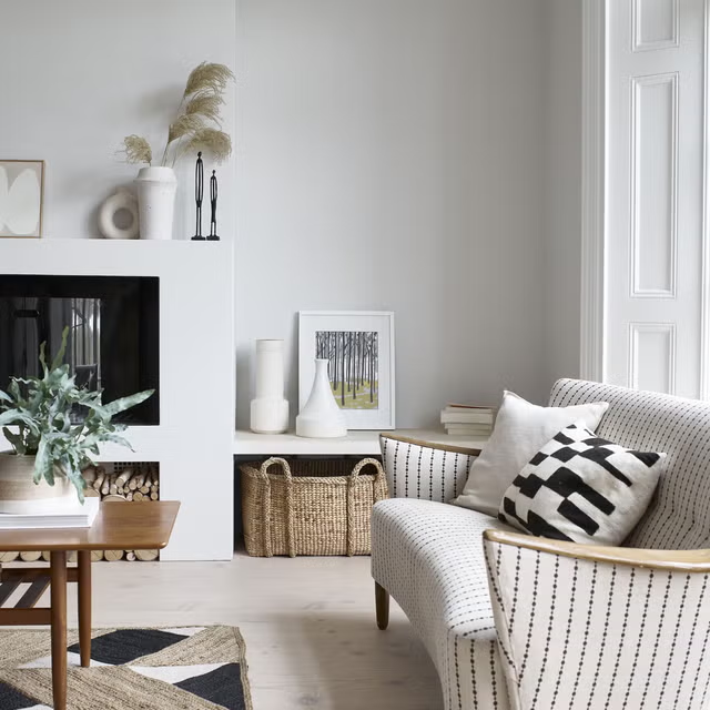
That bright builder white on your walls right now? It can read cold and a little cheap. Swap it for a warm white instead. Pantone named Cloud Dancer, a soft glowing white, its 2026 Color of the Year, and creamy whites like Alabaster or Swiss Coffee do the same job at home. A warm white base makes everything you layer on top look better. As designer Kelly Hoppen put it to Livingetc, the fact that Pantone finally picked a white says a lot about where neutrals are headed.
2. Swap Gray for Mushroom
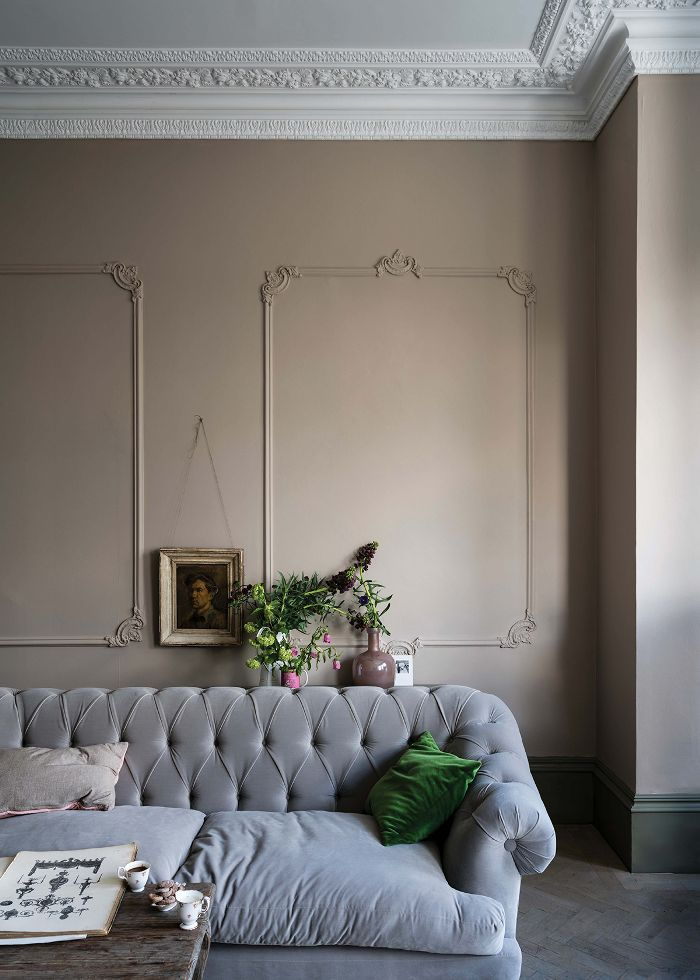
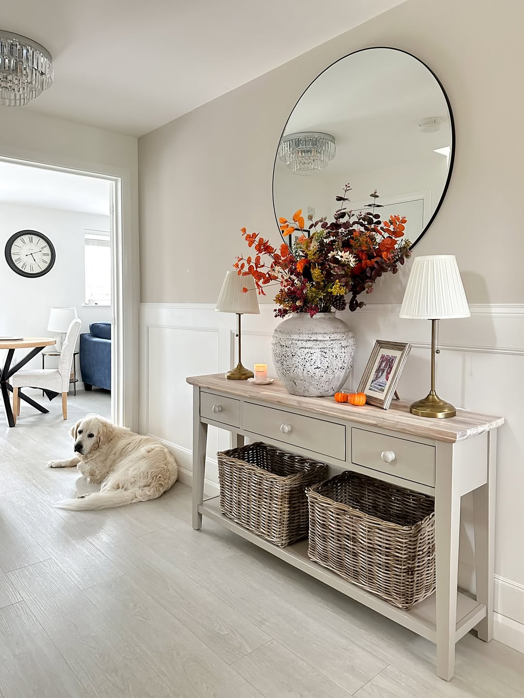
Cool gray had a long run, and now it’s the thing that dates a room fastest. Designers are calling gray walls and gray wood-look floors a sign of a tired home. The replacement getting a lot of love is mushroom. Redesign Daily described it as the “Goldilocks zone” between gray, beige, and taupe, never too cold and never too sterile. It works beautifully as a whole-home color, especially in rooms that don’t get much sun.s: mushroom paint color | taupe wall hallway | greige wall color | mushroom neutral walls | soft brown gray paint
3. Layer Three Neutrals in One Room
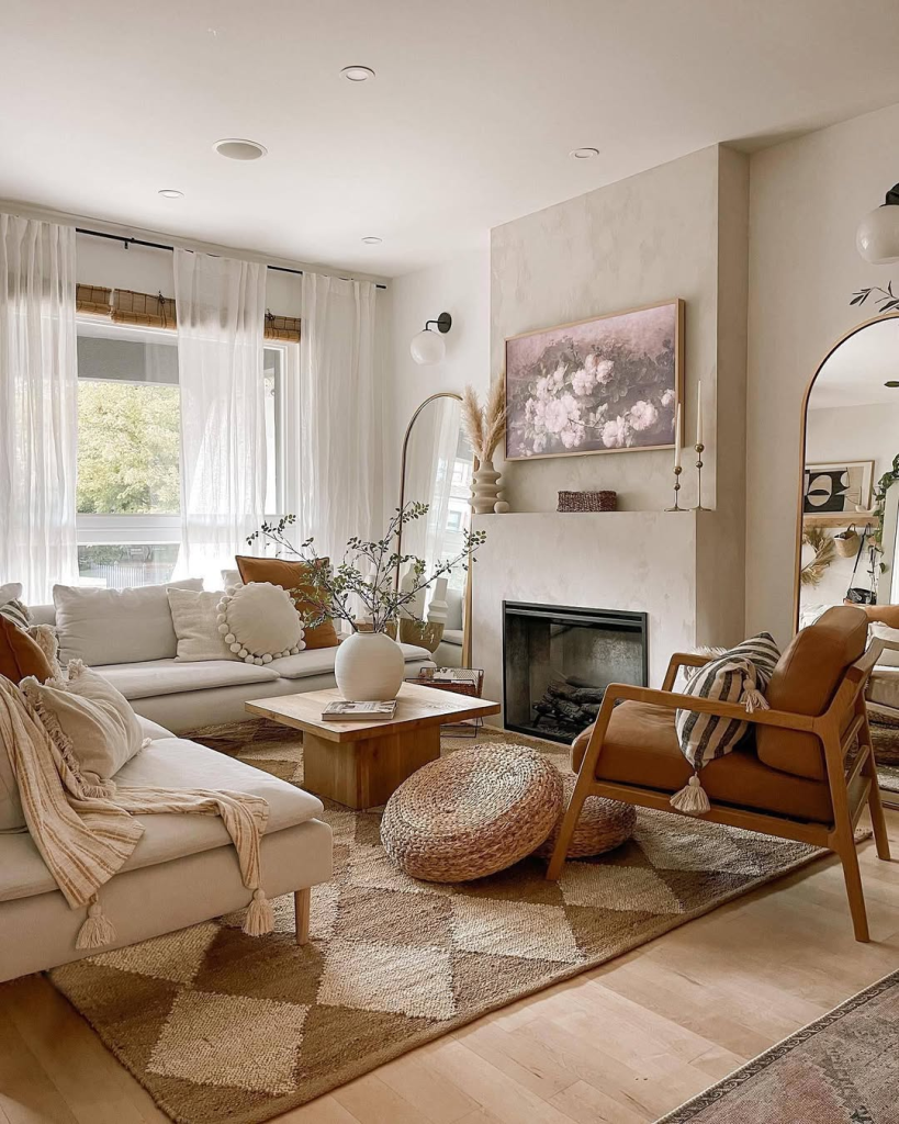
One flat beige across a whole room is what makes neutral feel dull. The fix is to use a few neutrals together. Think a creamy white, a soft oat, and a deeper camel, spread across your walls, sofa, rug, and pillows. Livingetc’s roundup of real neutral rooms showed this over and over. The room stays calm, but your eye has somewhere to go. That gentle range is what keeps decorating with neutrals from feeling like a blank box.
4. Let Texture Do the Heavy Lifting
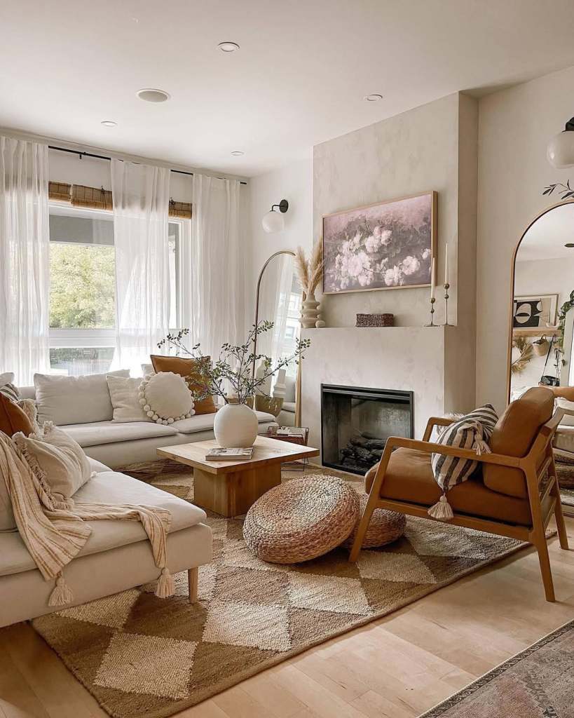
This is the one most people miss. When a neutral room falls flat, the problem usually isn’t the color. It’s the texture. Homes & Gardens said it plainly in 2026, the culprit is rarely color, it’s the absence of texture. Designer Abbie Naber told them you can skip color completely and lean on layered textures to make a room feel richer and more expensive. Start with your biggest surfaces. A nubby rug, a soft sofa, a chunky wood table. Mix soft, sturdy, and natural right from the start.
5. Mix Warm and Cool Undertones
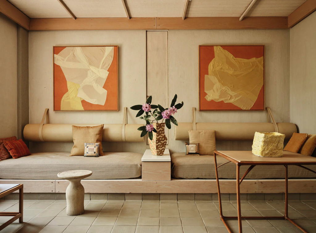
Every neutral leans warm or cool. Cream and camel lean warm. Dove gray and charcoal lean cool. Designer Emma Shone-Sanders told Livingetc that contrast is what gives a neutral scheme depth, and without it, things start to feel flat. So don’t pick all warm or all cool. Pair a cream wall with a walnut table. Set dove gray next to a deep charcoal cushion. That light and dark push is what makes the room look thought through instead of accidental.
6. Try Plaster Pink as a Neutral
Hear me out, because this isn’t a pink room. The palest plaster pink is almost white, with a soft warmth that reads as a neutral. Designer Birdie Fortescue told Livingetc she uses pale pink as a grounding color, layered with natural linen and jute. It’s one of the “new neutrals” designers leaned into for 2026. It’s lovely in low-light rooms where a cool white would feel a little sad. Use it on walls and let everything else stay quiet.
7. Treat Soft Green Like a Neutral
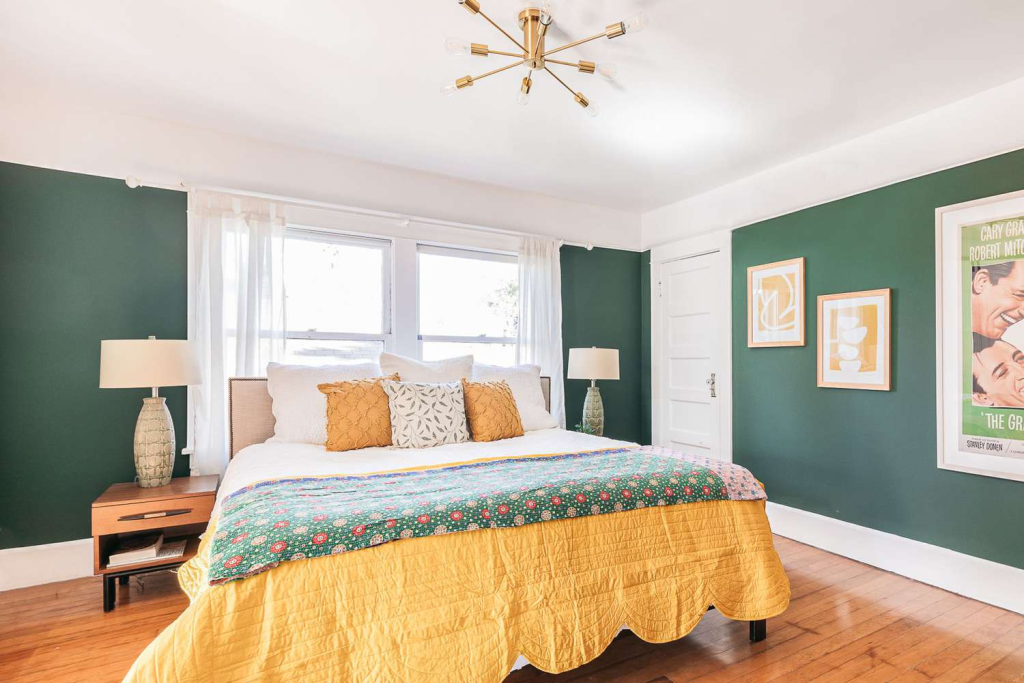
Green surprises people, but designers now use it the way they use beige. Soft sage and gentle mint pair with almost anything, which is the whole point of a neutral. Interior designer Simone Gordon told Livingetc that soft green is her “new neutral” for the year. You can color-drench a small room in it, or just use it on one piece like a cabinet or a chair. It brings a fresh, calm feeling without shouting.
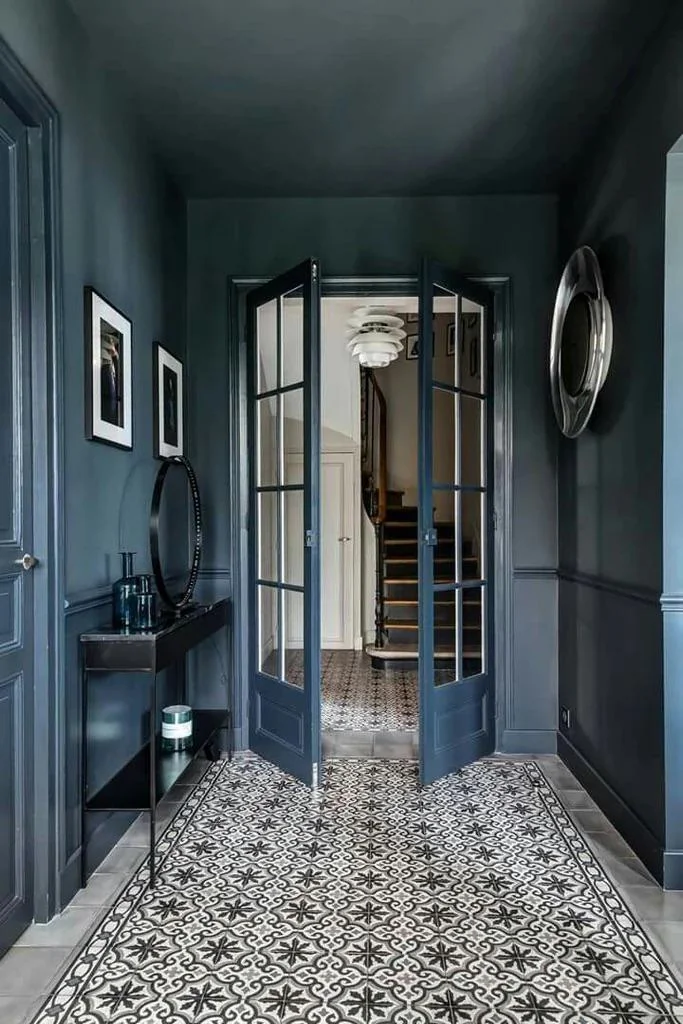
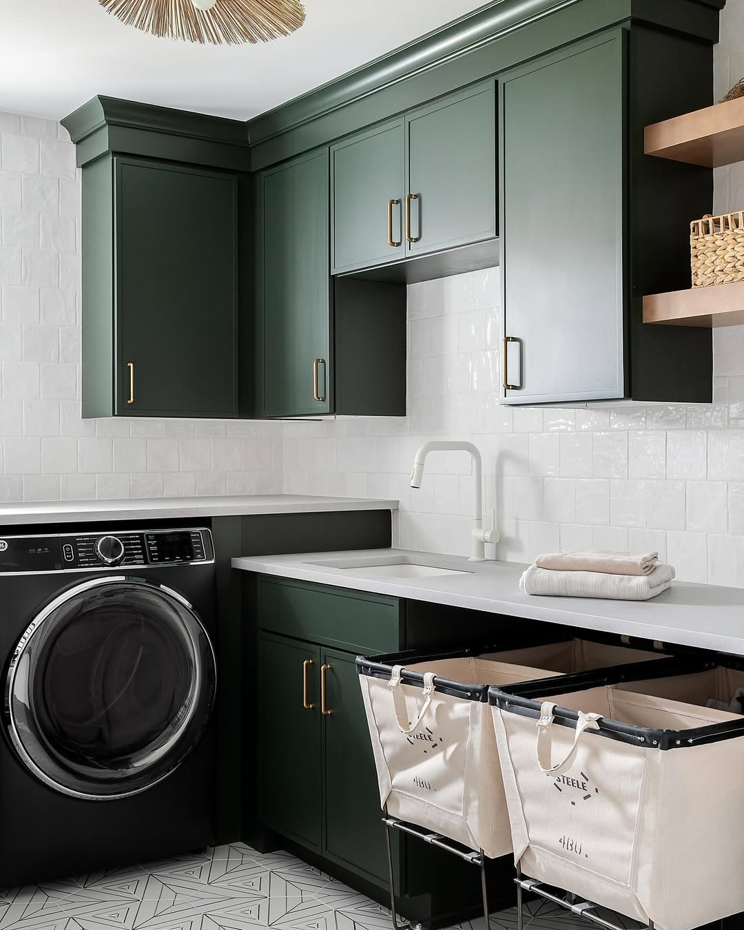
8. Anchor the Room With a Dark Neutral
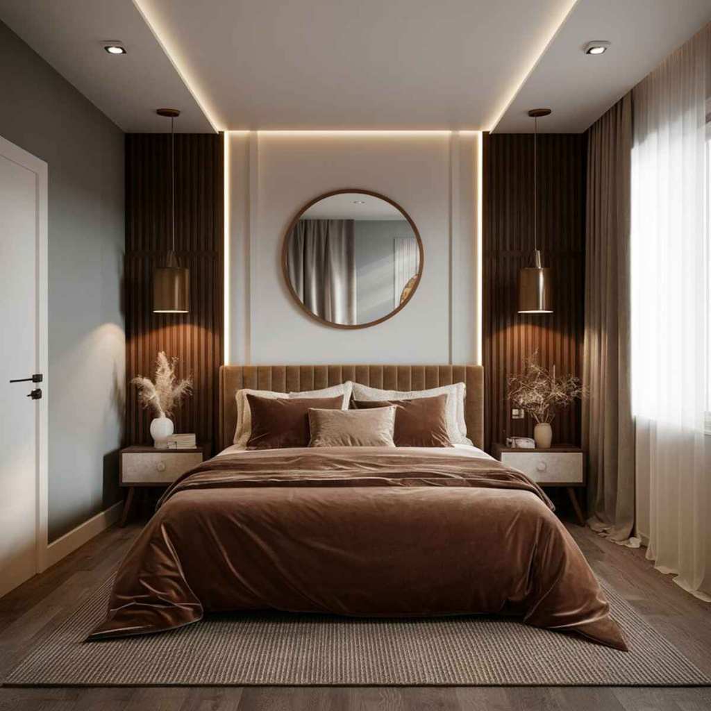
A light room needs one heavy spot to feel grounded, like a weight holding it down. That’s where a deep brown comes in. Benjamin Moore picked Silhouette, a rich espresso brown, as its 2026 Color of the Year, and Sherwin-Williams chose Universal Khaki, a warm mid-tone. You don’t need a bold color to add drama. Try the dark neutral on lower cabinets, one accent wall, or a wood dresser. It gives the whole room depth and that expensive, settled look.
9. Use One Color Through the Whole Home
Here’s a perk of a fresh home, you get to plan the flow from scratch. Pick one neutral and carry it through your main spaces. It makes rooms feel connected as you walk from one to the next. Sherwin-Williams’ Universal Khaki and Accessible Beige are both popular whole-home picks for exactly this. You can shift the tone a little room to room, lighter in the bonus room, a touch deeper in the den. The same family of color does the rest.
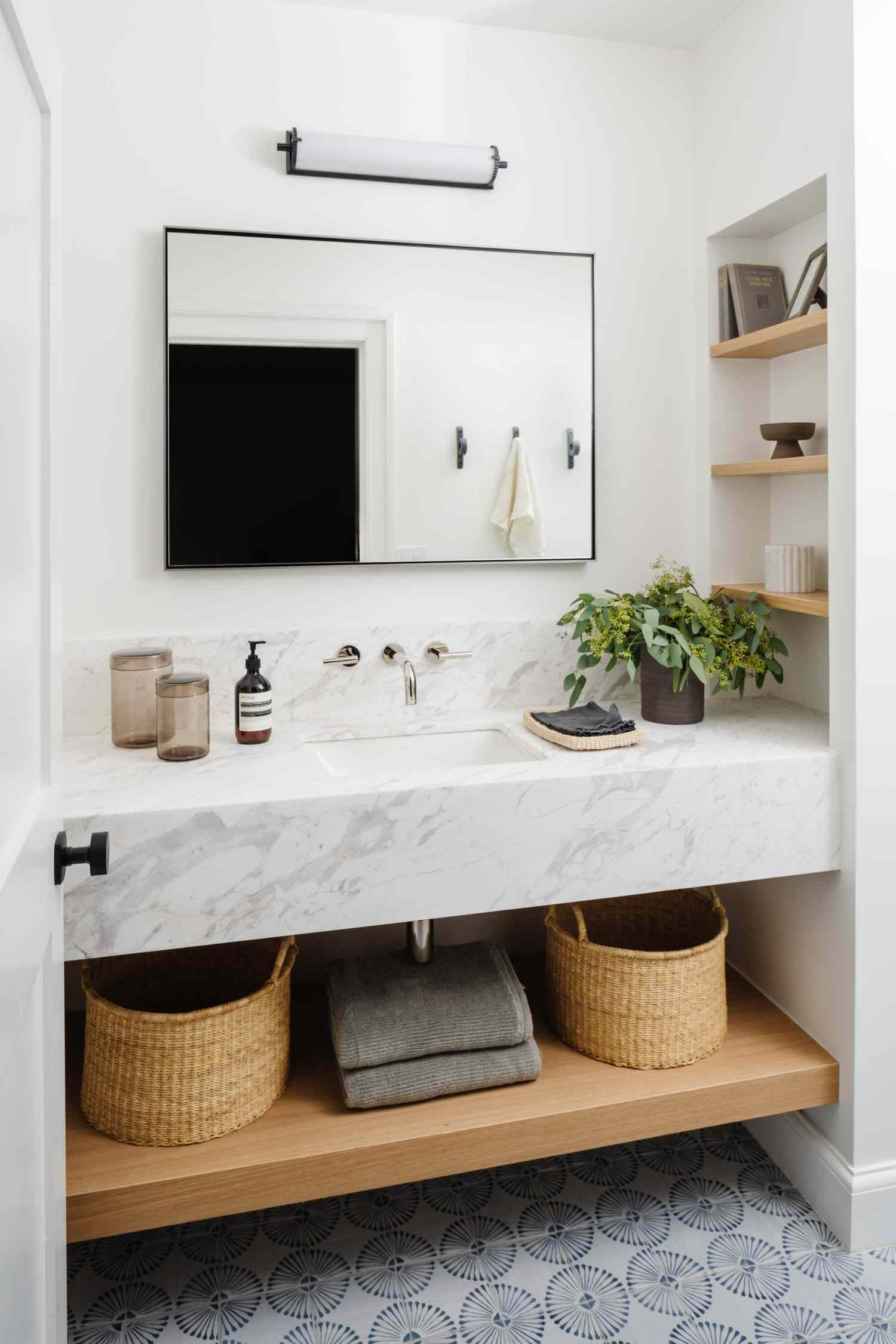
10. Build In Natural Materials
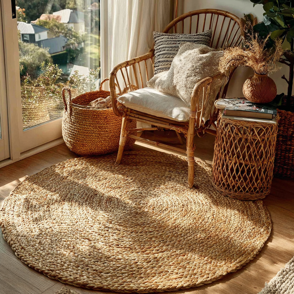
The fastest way to add warmth to a neutral room is material, not paint. Jute, linen, oak, rattan, stone, and wool all bring softness and depth on their own. Designers point to these again and again when they talk about making neutral rooms feel rich. A jute rug runs roughly $120 to $400, a linen throw around $40 to $90, and a rattan accent piece $60 to $200. These read as expensive and look better the more you use them. They do a lot of the work in decorating with neutrals.
11. Contrast Hard With Soft, Matte With Sheen
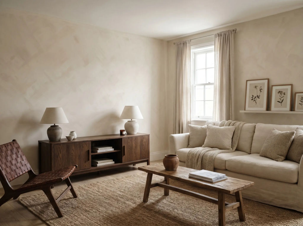
A room where everything feels the same goes flat fast. If it’s all smooth and polished, or all soft and plush, your eye has nothing to grab. The fix is contrast. Set something hard next to something soft. A linen cushion on a leather chair. A rough limewash wall behind a smooth ceramic lamp. United Furniture Group and designer Sarah Hart both flagged matching materials as a top reason rooms feel unfinished. Mix wood, metal, linen, and woven pieces on purpose.
12. Layer Your Lighting
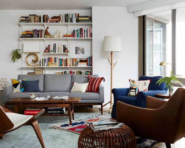
One ceiling light makes a neutral room feel harsh and flat, and it kills all that texture you worked on. The fix is cheap and easy. Add a floor lamp and a table lamp or two. Each new light source warms the room and shows off the texture in your rug, sofa, and walls. Soft pools of light at different heights make a space feel finished. Skip the single bright overhead as your only option.
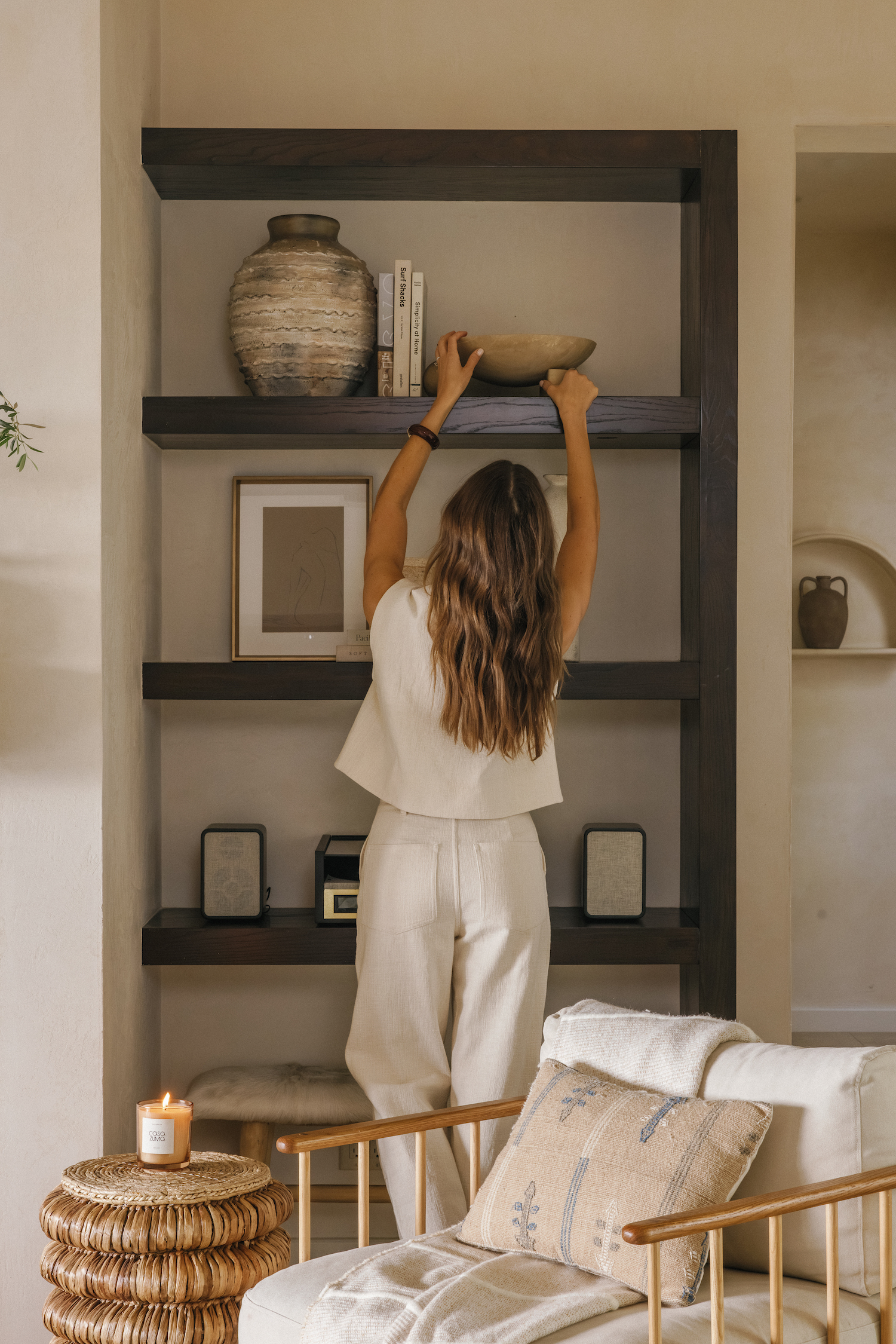
13. Add Vintage and Heirloom Pieces
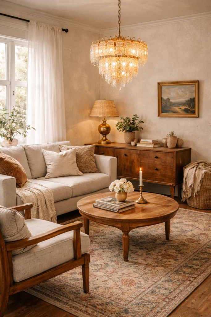
A neutral room can start to look like a catalog, where everything is new and nothing has a story. The fix is age. Designers and real estate trend reports for 2026 keep saying the same thing, personal and collected pieces beat matchy new sets. A worn wood stool, your grandma’s mirror, a flea-market bowl with a little wear. These pieces give a quiet room soul. They also stop your home from looking like everyone else’s.
14. Finish With One Quiet Metal
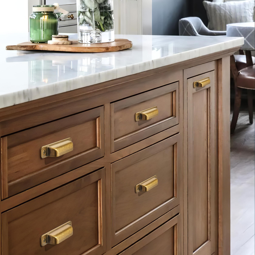
A small metal touch lifts a neutral room and adds a little shine. The trick is to pick one metal and repeat it. Brass, bronze, or an aged finish all work well. Designer Marcelina Janiszewska told Livingetc that metals like brass and antique bronze help raise a scheme and add interest. Don’t mix five different finishes, that just looks busy. Choose one, then echo it in your lamp, your cabinet pulls, and a small tray. Hardware swaps cost as little as $20.
15. Edit, and Don’t Over-Match
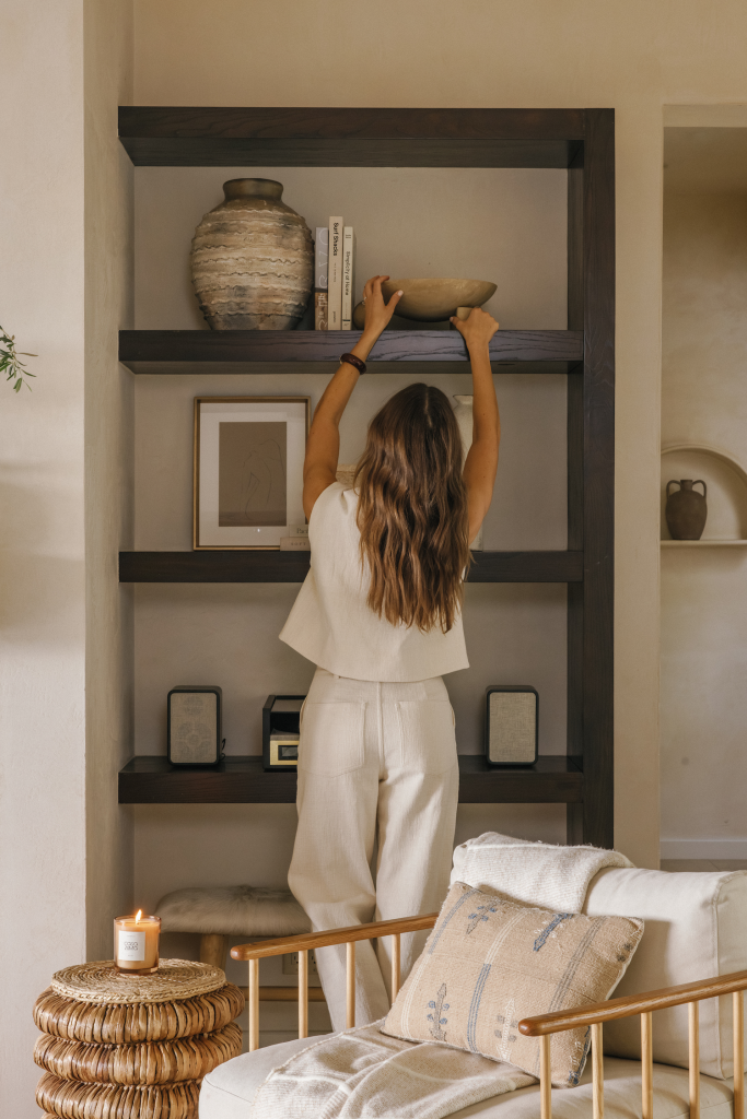
The last step is to take things away. A neutral room where every shade matches perfectly can feel lifeless. Designer Kanika Bakshi Khurana told Apartment Therapy that walking back into one of those tone-on-tone rooms months later, you feel a kind of emotional flatline. So leave a little breathing room. Let one or two things break the pattern, a darker pillow, a rougher basket, an odd vintage find. The most expensive-looking neutral rooms aren’t the fullest ones. They’re the ones that don’t try too hard to match.
Start Small, Start Today
A neutral home done the 2026 way is the opposite of boring. It’s soft, layered, full of texture, and it actually feels like you. You don’t have to do all 15 things this weekend. Pick your base first, a warm white or that lovely mushroom. Then chase texture, because that’s the part that makes or breaks the whole look. After that, add one or two personal pieces with a little age and a story.
The easiest thing you can do today? Grab a few peel-and-stick paint samples for $3 to $6 each and tape them to your wall. Watch how they shift from morning to night. That one small step tells you more than any trend report ever will.